Screens from your code
Turn the routes in your repository into editable screens built from your own components, and check them in dark mode, with long text and right to left, at your app's breakpoints.
On this page
When a repository is connected, Screens can start from the app you already have. Each route M1rror finds in your code appears as a screen, and you can import it as an editable screen built from your team's own components. You can then check every screen in your design system's themes, with longer text or right to left, at the widths your app actually uses.
Before you start
Connect a repository and scan it. Screens from code work with React and TypeScript apps, including file-based routes in Next.js, Remix, React Router and TanStack Router. After the scan, your routes appear in the Screens panel as screens found in code, and your components appear in System mode › Components.
Import a screen from your code
Open a screen found in code
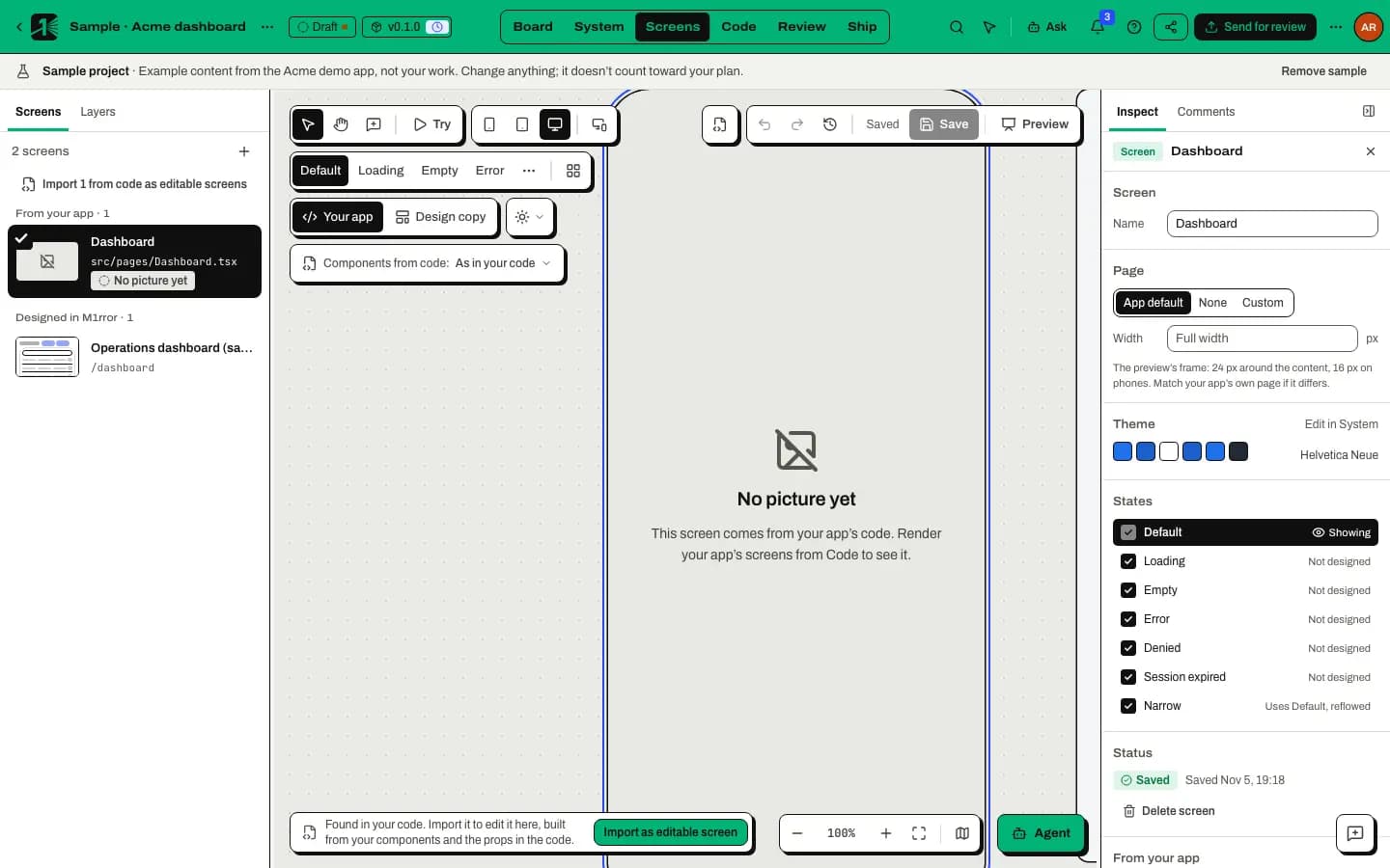
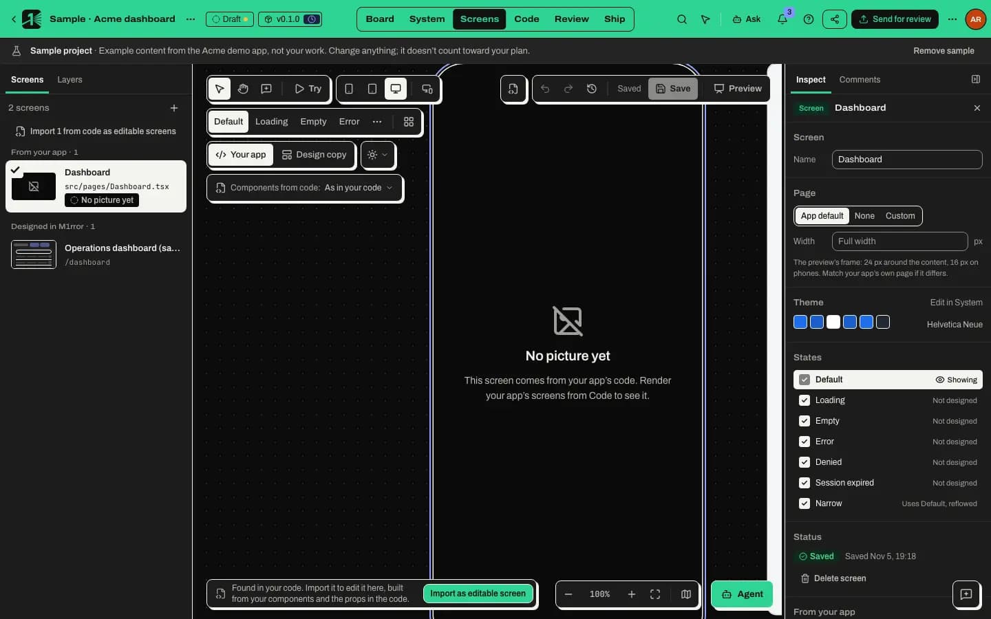
In Screens mode, select a screen that was found in your code and has no design here yet. The canvas says Found in your code. Import it to edit it here, built from your components and the props in the code.
Import it
Select Import as editable screen, or the Import from code button at the top right of the canvas. To import every such screen at once, select Import N from code as editable screens in the Screens panel.
M1rror rebuilds the screen from the code it read for that route:
- your components, with the props the code writes out, checked against each component's props;
- headings, buttons, links, inputs and text as the matching built-in blocks;
- containers as stacks and rows.
Read what couldn't be rebuilt
After the import, the canvas says which file the screen came from and lists, in plain words, anything it couldn't rebuild. If nothing is missing, it says Everything the code writes on this page was rebuilt.
Keep it, or undo
Edit the screen like any other. If you'd rather not keep it, select Undo import: the screen goes back to the version found in code, and Import is offered again.
What an import never invents
M1rror only rebuilds what the code writes out. Anything else is counted and listed next to the screen:
- Props worked out at run time, such as
disabled={saving}, keep the component's own default. - Data, such as a user's name, shows as a
{name}gap. - Conditional parts are drawn as if the condition were true.
- Lists are drawn with one item.
- Components that aren't in your system are drawn as muted, labelled stand-ins.
- Images and media are left out.
- A required prop the code fills at run time gets a sample value so the component can draw, and the note names it, for example
TextField.value.
A screen that already has a design here is never replaced without asking.
Draw with your team's components
Screens built from your components use them as your code does:
- The props panel follows the props your component's types declare: text and choices, content slots such as
children, and event handlers, which take a named sample event. Each control says what the code uses when a prop is left unset. - When the design agent drafts first screens, it builds them from your own components before falling back to plain blocks.
- Components from code: As in your code shows the values your code has today; After shipping shows your design system's values mapped onto your code's own variables.
Check the look: themes, long text and right to left
Use Look at the top left of the canvas (on a narrow window it's under More view options):
- Theme: draw the screens in any theme your design system has, such as Dark. If the system has only one look, the menu says so and suggests adding a Dark theme in System.
- Text: Text as written, Long text (+35%, accented) to find labels that overflow or truncate, or Right to left to check a mirrored layout.
The Look changes only how screens are drawn. Nothing about the screen itself changes. Review uses the same choices, so reviewers can see a release in its own themes and with the same text stress.
Your app's breakpoints
Phone, Tablet and Desktop use your team's own widths when M1rror finds them: first in your design tokens, then in your code (Tailwind's screens or @theme, a theme object or repeated media queries). With All sizes, a note says where the widths came from, for example Widths from your design tokens (breakpoints): 390, 900 and 1200 px. With nothing found, the sizes are 390, 768 and 1280 pixels wide.
Many screens
To keep large projects fast, the Screens list shows each screen as an outline sketch of its layout, labelled as such, and the canvas draws at most three screens live at a time (a few more when you arrange one screen by size or state). Screens out of view are unloaded.
Related
Last updated
Edit this page on GitHub